CSS Grid is a modern layout system that we can use when laying out pages.
It’s often compared with Flexbox. And whilst they are both excellent systems for working with complex layouts, there is one major difference: CSS Grid works on 2 dimensions (rows and columns), while Flexbox works on a single dimension only (rows or columns).
If you only need to define a layout as a row or a column, then Flexbox will likely suit your needs. When working in both dimensions — it’s time for CSS Grid!
CSS Grid basics
We activate the grid layout by making an HTML element a grid container:
Our HTML:
<div class="grid-container">
  <!-- content -->
</div>
In our CSS, we simply set its display property to grid:
.grid-container {
  display: grid;
}
A grid layout consists of a parent element, with one or more child elements.
There are a set of properties which can be applied to the container element, as well as any child elements (being each individual item in the grid).
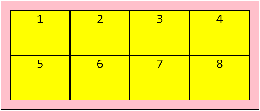
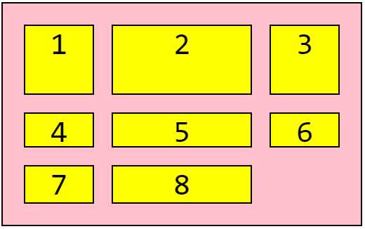
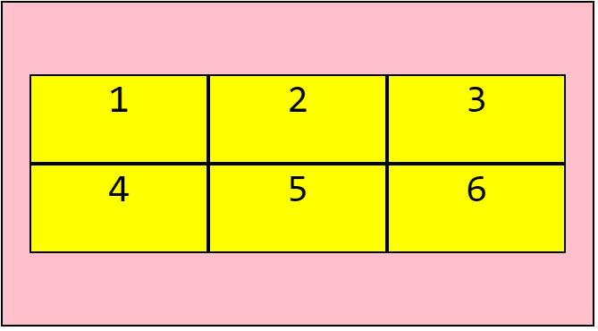
Throughout this guide we’ll work with the following code:
HTML:
<div class="grid-container">
  <div class="grid-item">1</div>
  <div class="grid-item">2</div>
  <div class="grid-item">3</div>
  <div class="grid-item">4</div>
  <div class="grid-item">5</div>
  <div class="grid-item">6</div>
  <div class="grid-item">7</div>
  <div class="grid-item">8</div>
</div>
And our CSS styles:
* {
  font-family: monospace;
  text-align: center;
  font-size: 44px;
}
.grid-container {
  display: grid;
  padding: 30px;
  background-color: pink;
  border: 2px solid #000;
}
.grid-container > div {
  background-color: yellow;
  border: 2px solid #000;
}
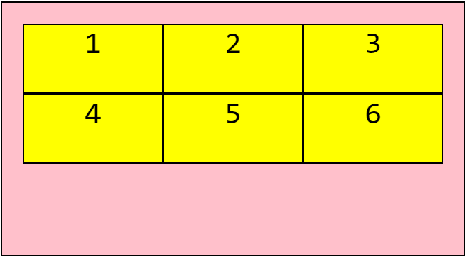
Defining Columns & Rows
The most common container properties are grid-template-columns and grid-template-rows. With these properties we define both the number of columns & rows as well as the width of each.
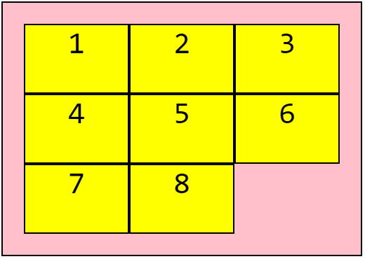
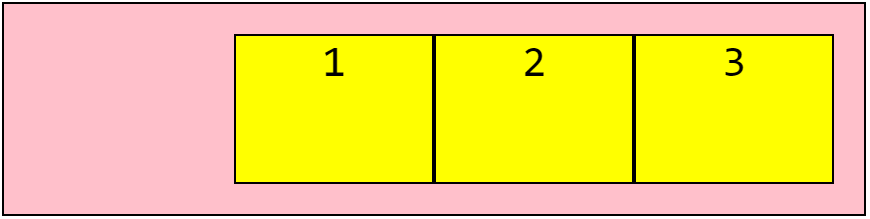
For example, let’s tell our grid to layout its items (child elements) in 4 columns at 200px wide, and 2 rows with a height of 150px each.
.grid-container {
  display: grid;
  grid-template-columns: 200px 200px 200px 200px;
  grid-template-rows: 150px 150px;
}
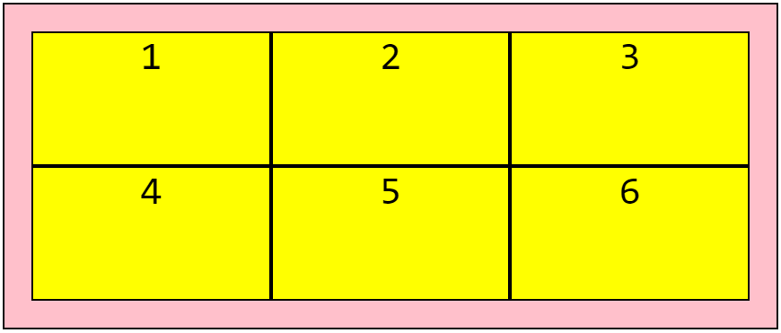
And lets now make it a smaller 3x3 grid:
.grid-container {
  display: grid;
  grid-template-columns: 150px 150px 150px;
  grid-template-rows: 100px 100px 100px;
}
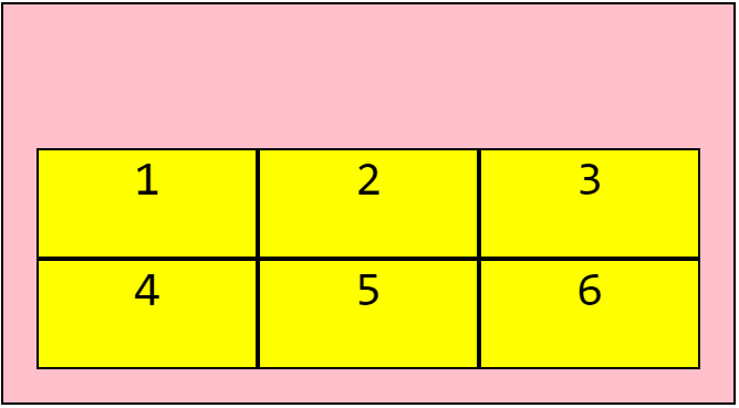
Auto dimensions
Often you’ll be working with elements with no fixed size. For example, you could have a fixed navbar followed by a flexible content section, then a fixed footer section. For this we can use auto and the layout will adapt to the size of our content:
.grid-container {
  display: grid;
  grid-template-rows: 50px auto 150px;
}
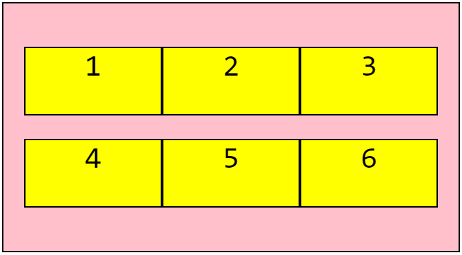
Adding space between grid items
We can add spacing between grid items using grid-column-gap and/or grid-row-gap:
.grid-container {
  display: grid;
  grid-template-columns: 100px 200px 100px;
  grid-template-rows: 100px 50px;
  grid-column-gap: 25px;
  grid-row-gap: 25px;
}
We could also use the shorthand grid-gap to set both at once:
.grid-container {
  display: grid;
  grid-template-columns: 100px 200px 100px;
  grid-template-rows: 100px 50px;
  grid-gap: 25px;
}
Grid item positioning
We can control how much space each grid item takes up in the column or row with the following properties:
grid-column-startgrid-column-endgrid-row-startgrid-row-end
Let’s see an example:
.grid-container {
  display: grid;
  grid-template-columns: 200px 200px 200px 200px;
  grid-template-rows: 150px 150px;
}
.grid-item1 {
  grid-column-start: 1;
  grid-column-end: 3;
}
.grid-item6 {
  grid-column-start: 3;
  grid-column-end: 5;
}
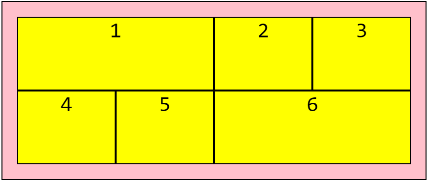
Here’s we’ve added classes to the first & sixth items in our grid.
The numbers correspond to the vertical line separating each column. So by setting grid-column-start to 1 and grid-column-end to 3, we’re telling our element to start at the first line & end at the third.
Similarly we’ve told our sixth element to start at the 3rd line and end at 5.
This of course also applies to grid-row-start and grid-row-end, with the cells expanding across rows instead of columns.
Item position shorthand
We can repeat the above using the shorthand properties of grid-column & grid-row, like so:
.grid-container {
  display: grid;
  grid-template-columns: 200px 200px 200px 200px;
  grid-template-rows: 150px 150px;
}
.grid-item1 {
  grid-column: 1 / 3;
}
.grid-item6 {
  grid-column: 3 / 5;
}
And we could take this even further by using grid-area as a shorthand for grid-column and grid-row. This would only apply in cases where we need an item to span both rows & columns:
.grid-item1 {
  grid-row: 1 / 4;
  grid-column: 3 / 5;
}
Would become:
.grid-item1 {
  grid-area: 1 / 3 / 4 / 5;
}
With the order being: grid-row-start > grid-column-start > grid-row-end > grid-column-end.
Using 'span' to position items
Another option we have when positioning our items is span:
.grid-container {
  display: grid;
  grid-template-columns: 200px 200px 200px 200px;
  grid-template-rows: 150px 150px;
}
.grid-item1 {
  grid-column: 1 / span 2;
}
.grid-item6 {
  grid-column: 3 / span 2;
}
With grid-column: 1 / span 2 starting at line 1 and spanning across 2 columns.
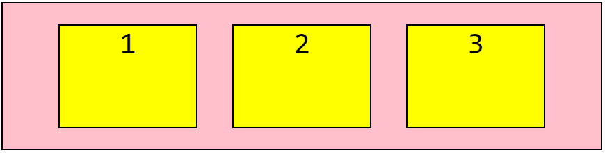
Using fraction units
One of the great benefits of grid is the ability to easily create highly flexible layouts.
Fraction units give us the ability to build layouts without needing to specify fixed dimensions.
For example, lets divide a grid into 3 columns of equal width, each taking up 1⁄3 of the available space:
.grid-container {
  grid-template-columns: 1fr 1fr 1fr;
}
Too simple!
Using other CSS units
We can use any of the CSS length units. So feel free to use a mix of percentages, pixels, rem, em and fractions:
.grid-container {
  grid-template-columns: 2rem 25% 2fr 1fr
}
Using repeat()
We can use repeat() to specify the number of times a row or column will be repeated, and the length of each.
It’s a handy way to quickly put together a layout & it also reduces lines of code! For example, you could define 3 columns of equal width as follows:
.grid-container {
  grid-template-columns: repeat(3, 1fr);
}
Using minmax()
We use minmax() to specify a minimum or maximum width for a grid track.
Let’s say you want a column to be between 100px and 300px, followed by a 1fr column:
.grid-container {
  grid-template-columns: minmax(100px, 300px) 1fr;
}
The value for min has to be smaller than the value for max. And fr units can’t be used for the min value, but they can be used for the max!
By using a 1fr as the max value, you’ll ensure that the track expands and takes up the available space:
.grid-container {
  grid-template-columns: minmax(250px, 1fr) 1fr;
}
Used this way, minmax() allows us to create grid tracks that adapt to the available space, but that don’t shrink narrower than a specified size.
Now if the browser is resized, the 1st column won’t shrink to less than 250px.
You can also use the auto, min-content and max-content keywords as the min or max values.
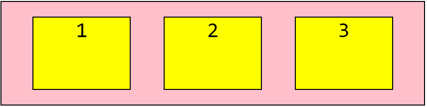
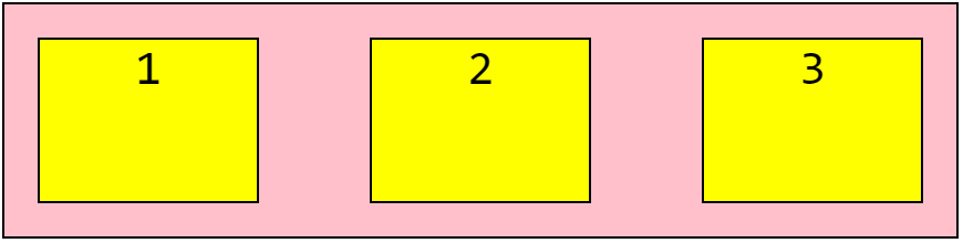
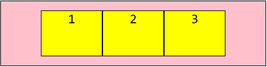
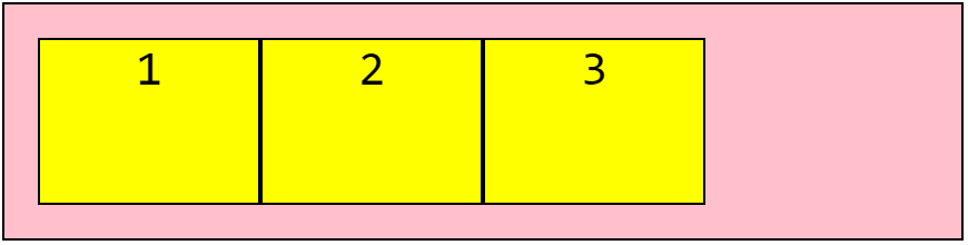
Using justify-content
We use justify-content to align the whole grid inside the container.
There are a number of values we can work with:
space-evenlyspace-aroundspace-betweencenterstartend
Keep in mind that the grid width has to be less than the container width for the justify-content to work!
Let’s see an example of each:
.grid-container {
   display: grid;
   justify-content: space-evenly;
}
.grid-container {
   display: grid;
   justify-content: space-around;
}
.grid-container {
   display: grid;
   justify-content: space-between;
}
.grid-container {
   display: grid;
   justify-content: center;
}
.grid-container {
   display: grid;
   justify-content: start;
}
.grid-container {
   display: grid;
   justify-content: end;
}
Using align-content
We use the align-content property to vertically align the whole grid inside the container.
Our grid height needs to be less than the container height for this property to work.
.grid-container {
   display: grid;
   align-content: space-evenly;
}
.grid-container {
   display: grid;
   align-content: space-around;
}
.grid-container {
   display: grid;
   align-content: space-between;
}
.grid-container {
   display: grid;
   align-content: center;
}
.grid-container {
   display: grid;
   align-content: start;
}
.grid-container {
   display: grid;
   align-content: end;
}
Using grid-template-areas
We can use grid-template-areas to define named areas & move them around inside the grid, and also to expand grid items across multiple rows and/or columns.
Let’s use grid-template-areas to build a typical layout with a header up top, a sidebar to the left of the main content, followed by a footer:
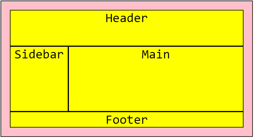
And the code used:
HTML:
<div class="grid-container">
  <main>
    Main
  </main>
  <aside>
    Sidebar
  </aside>
  <footer>
    Footer
  </footer>
  <header>
    Header
  </header>
</div>
CSS:
.grid-container {
  display: grid;
  grid-template-columns: 200px 200px 200px 200px;
  grid-template-rows: 125px 225px;
  grid-template-areas:
    "header header header header"
    "sidebar main main main"
    "footer footer footer footer";
}
main {
  grid-area: main;
}
aside {
  grid-area: sidebar;
}
header {
  grid-area: header;
}
footer {
  grid-area: footer;
}
Notice that despite the header being the last element in our HTML, it’s still at the top of our page. This is because we’ve defined it’s position in CSS with grid-template-areas using the grid-area property.
Making this responsive
If we want the sidebar to move below our main content on mobile devices, we can easily do so using a media query:
@media (max-width: 500px) {
  .grid-container {
    grid-template-columns: 1fr;
    grid-template-areas:
      "header"
      "main"
      "sidebar"
      "footer";
  }
}
Related Posts:

A little about me..
Hey, I’m Tim! 👋
I’m a freelance business owner, web developer & author. I teach both new and experienced freelancers how to build a sustainable and successful freelancing business. Check out my Complete Guide to Freelancing if you'd like to find out more.
While you're here, you can browse through my blogs where I post freelancing tips, code tutorials, design inspiration, useful tools & resources, and much more! You can also join the newsletter, or find me on X.
Thanks for reading! 🎉