In this tutorial, we’ll learn how to add a ton of flexibility to our layouts using Flexbox!
We use the *Flexible Box Module (*aka. Flexbox), to create responsive elements within containers that can be automatically arranged based on the screen size. It also has a number of properties that give us total control over how space is distributed between items on a page.
Otherwise known as the “one dimensional” model, Flexbox is ideal for laying out elements in a single direction (either in a row or a column). The CSS Grid Layout is the “two dimensional” model which is better suited to laying out elements in both directions simultaneously.
Flexbox gives us some very powerful features, which we’ll be exploring in this guide!
The Flexbox Layout
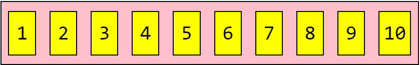
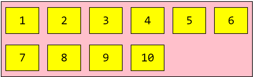
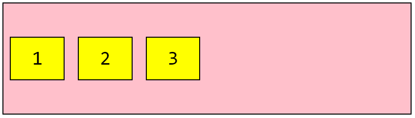
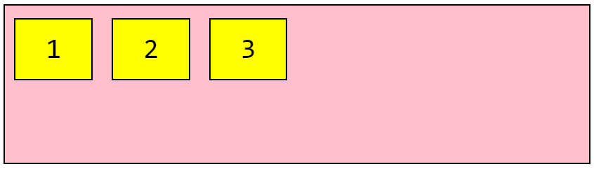
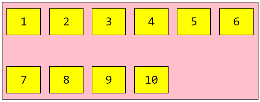
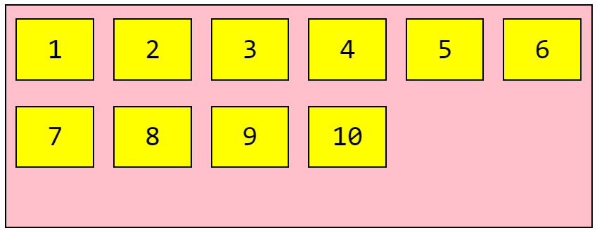
Here we have a container (in pink), containing a number of elements (in yellow boxes):
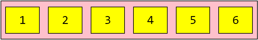
HTML:
<div class="flex-container">
  <div>1</div>
  <div>2</div>
  <div>3</div>
  <div>4</div>
  <div>5</div>
  <div>6</div>
</div>
CSS:
* {
  font-family: monospace;
  text-align: center;
  font-size: 44px;
}
.flex-container {
  display: flex;
  flex-wrap: nowrap;
  background-color: pink;
  border: 2px solid #000;
}
.flex-container > div {
  width: 100px;
  margin: 20px 15px;
  padding: 10px;
  line-height: 75px;
  background-color: yellow;
  border: 2px solid #000;
}
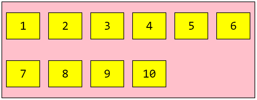
This is the code we’ll be working with throughout the guide. Let’s now break it down by examining the key properties!
The Container Element
The first step when using Flexbox is to define a flex container. We do this by setting the display property to flex, like so:
.flex-container {
  display: flex;
}
We now have a number of flex container properties available:
flex-directionflex-wrapflex-flowjustify-contentalign-itemsalign-content
Setting the container also enables a context for all its direct children (known as flex items). More on this later. For now, let’s focus on the flex container properties!
flex-direction
The flex-direction property defines the main-axis, thus defining the direction in which items are placed.
Flex items lay either horizontally with row or vertically with column.
Use the row value to place items in horizontal order (from left to right):
.flex-container {
  display: flex;
  flex-direction: row;
}
The order can be reversed with row-reverse (items will be from right to left):
.flex-container {
  display: flex;
  flex-direction: row-reverse;
}
To place our items vertically (from top to bottom), we use the column value:
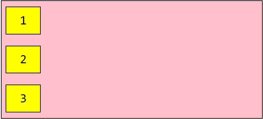
.flex-container {
  display: flex;
  flex-direction: column;
}
And column-reverse will reverse the order (from bottom to top):
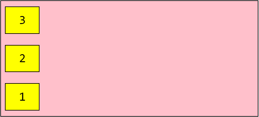
.flex-container {
  display: flex;
  flex-direction: column-reverse;
}
flex-wrap
The flex-wrap property lets us choose whether our items should wrap or not.
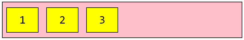
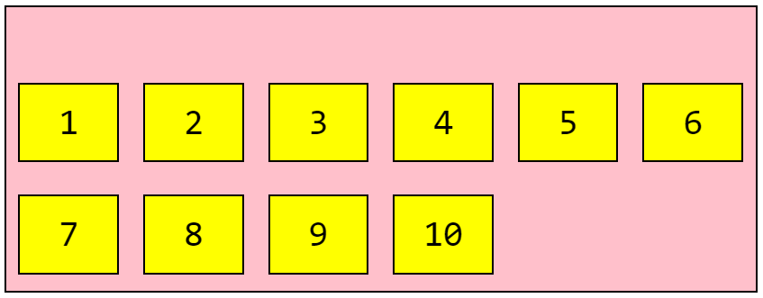
By default, flex items will always try to fit on one line:
.flex-container {
  display: flex;
  flex-wrap: nowrap;
}
Note that as it’s the default, nowrap doesn’t need to be set. Our flex items will not wrap.
When we set the wrap value, our flex items will wrap if necessary:
.flex-container {
  display: flex;
  flex-wrap: wrap;
}
We can also use wrap-reverse to reverse the order:
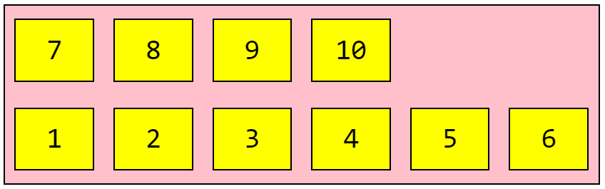
.flex-container {
  display: flex;
  flex-wrap: wrap-reverse;
}
flex-flow
The flex-flow property is a shorthand for the flex-direction and flex-wrap properties. The default value is row nowrap.
.flex-container {
  display: flex;
  flex-flow: row wrap;
}
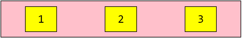
justify-content
The justify-content property defines the alignment of flex items on the main axis:
.flex-container {
  display: flex;
  justify-content: center;
}
That’s how simple it is to center our flex items!
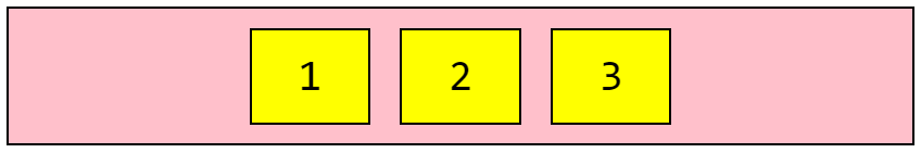
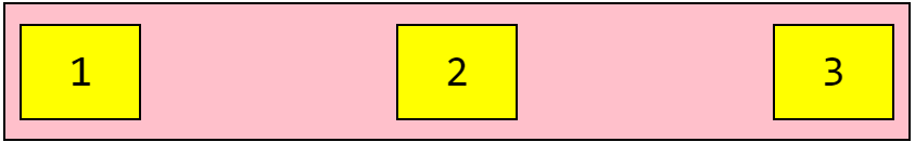
We can also use flex-start to place our items at the beginning of the container (this is the default):
.flex-container {
  display: flex;
  justify-content: flex-start;
}
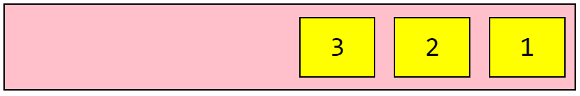
To place our items at the end, use flex-end:
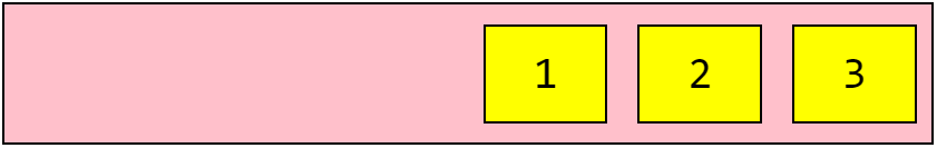
.flex-container {
  display: flex;
  justify-content: flex-end;
}
Use space-around to display flex items with space before, between, and after:
.flex-container {
  display: flex;
  justify-content: space-around;
}
Which differs from space-between which distributes space between our flex items:
.flex-container {
  display: flex;
  justify-content: space-between;
}
align-items
The align-items property defines how items are laid out along the cross axis.
I’ve increased the height of the container in our demo code to 250px, to better show the effects.
To align items in the middle of the container, we use center:
.flex-container {
  display: flex;
  align-items: center;
}
To place at the top, use flex-start:
.flex-container {
  display: flex;
  align-items: flex-start;
}
Or use flex-end to place at bottom of the container:
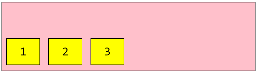
.flex-container {
  display: flex;
  align-items: flex-end;
}
The default value of stretch will stretch our items to fill the container:
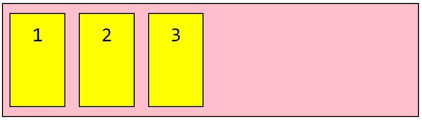
.flex-container {
  display: flex;
  align-items: stretch;
}
The baseline value will align items according to their baselines (I’ve used alternating font-size values for illustration):
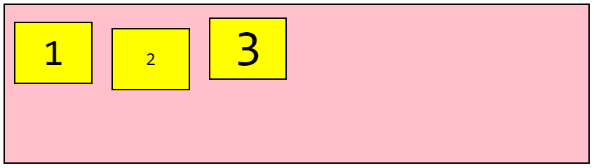
.flex-container {
  display: flex;
  align-items: baseline;
}
align-content
The align-content property is used to align the flex containers’ lines.
In these examples, the demo container height has been increased to 350px and the flex-wrap property to is set to wrap, to better illustrate how align-content works.
Note: this property has no effect when there is only one line of flex items!
Setting space-between will display each flex line with equal space between them:
.flex-container {
  display: flex;
  flex-wrap: wrap;
  align-content: space-between;
}
The space-around value will distribute space before, between, and after each flex line:
.flex-container {
  display: flex;
  flex-wrap: wrap;
  align-content: space-around;
}
The default stretch value stretches the flex lines to fill any remaining space:
.flex-container {
  display: flex;
  flex-wrap: wrap;
  align-content: stretch;
}
We can use center to display the flex lines in the middle of the container:
.flex-container {
  display: flex;
  flex-wrap: wrap;
  align-content: center;
}
Or flex-start to position at the start of the container:
.flex-container {
  display: flex;
  flex-wrap: wrap;
  align-content: flex-start;
}
And finally flex-end to position our lines at the end of the container:
.flex-container {
  display: flex;
  flex-wrap: wrap;
  align-content: flex-end;
}
How to achieve perfect centering
It’s quite simple with Flexbox! Just ensure both justify-content and align-items are set to center:
.flex-container {
  display: flex;
  justify-content: center;
  align-items: center;
}
Child Elements (Flex items)
Now we’ll take a look the set of properties we can apply to child elements (otherwise known as our flex items).
Any direct child elements of a flex container will automatically become flex items.
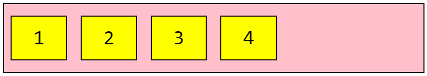
<div class="flex-container">
  <div>1</div>
  <div>2</div>
  <div>3</div>
  <div>4</div>
</div>
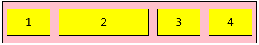
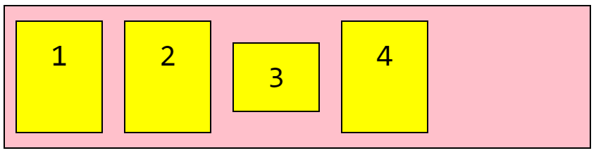
So the four yellow boxes are our flex items, as they’re direct children of flex-container.
The flex item properties are:
orderflex-growflex-shrinkflex-basisalign-selfflex
order
The order property controls the order in which flex items appear in the flex container.
The value must be a number, like so:
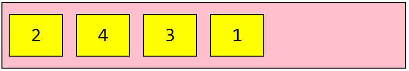
<div class="flex-container">
  <div style="order: 4">1</div>
  <div style="order: 1">2</div>
  <div style="order: 3">3</div>
  <div style="order: 2">4</div>
</div>
flex-grow
The flex-grow property gives a flex item the ability to grow. It defines the amount of available space that the item should take up, relative to the rest of the flex items.
The value must be a number.
If all items have flex-grow set to 1, the remaining space in the container will be distributed equally to each flex item.
If one of the children has a value of 2, the remaining space would (attempt to) take up double the space of the others:
<div class="flex-container">
  <div style="flex-grow: 1">1</div>
  <div style="flex-grow: 2">2</div>
  <div style="flex-grow: 1">3</div>
  <div style="flex-grow: 1">4</div>
</div>
flex-shrink
The flex-shrink property defines the ability for a flex item to shrink relative to the rest of the flex items.
For example, we might not want the second flex item to shrink as much as the others:
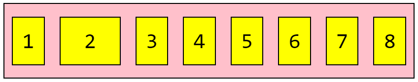
<div class="flex-container">
  <div>1</div>
  <div style="flex-shrink: 0">2</div>
  <div>3</div>
  <div>4</div>
  <div>5</div>
  <div>6</div>
  <div>7</div>
  <div>8</div>
</div>
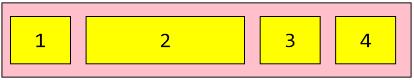
flex-basis
The flex-basis property defines the default size of an element before any remaining space is distributed.
Let’s set the initial length of the third item to 300 pixels:
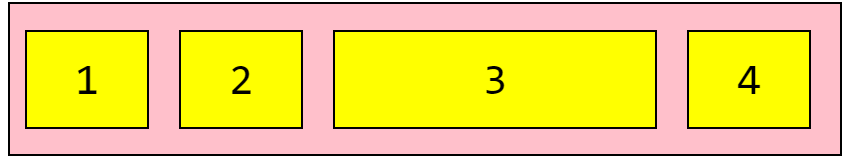
<div class="flex-container">
  <div>1</div>
  <div>2</div>
  <div style="flex-basis: 300px">3</div>
  <div>4</div>
</div>
align-self
The align-self property allows the default alignment (the one specified by align-items) to be overridden for individual flex items.
In these examples we’ll use a 200 pixels high container, to better illustrate the align-self property.
Let’s align the third flex item in the middle of the container (the others are defaulting to stretch:
<div class="flex-container">
  <div>1</div>
  <div>2</div>
  <div style="align-self: center">3</div>
  <div>4</div>
</div>
And let’s align the second flex item with the bottom, and the third flex item with the top:
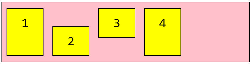
<div class="flex-container">
  <div>1</div>
  <div style="align-self: flex-end">2</div>
  <div style="align-self: flex-start">3</div>
  <div>4</div>
</div>
flex (shorthand)
The flex property is shorthand for flex-grow, flex-shrink, and flex-basis combined. The flex-shrink and flex-basis properties are optional, with the default being 0 1 auto.
For example, let’s make the second flex item not growable (0), not shrinkable (0), and give it an initial length of 300px:
<div class="flex-container">
  <div>1</div>
  <div style="flex: 0 0 300px">2</div>
  <div>3</div>
  <div>4</div>
</div>
Related Posts:

A little about me..
Hey, I’m Tim! 👋
I’m a freelance business owner, web developer & author. I teach both new and experienced freelancers how to build a sustainable and successful freelancing business. Check out my Complete Guide to Freelancing if you'd like to find out more.
While you're here, you can browse through my blogs where I post freelancing tips, code tutorials, design inspiration, useful tools & resources, and much more! You can also join the newsletter, or find me on X.
Thanks for reading! 🎉