If you’re unfamiliar with BEM, its simple to get started! It’ll add a ton of structure, scalability & robustness to an otherwise un-BEM’d stylesheet.
What is BEM?
BEM — Block Element Modifier is a methodology that helps you to create reusable components and code sharing in front-end development — getbem.com
If you’ve ever seen class names like form__submit--disabled that’s BEM in action. The use of this methodology allows us to create a more consistent coding structure in both our HTML and CSS/Sass files.
How do I BEM?
All you need to do is name your classes in accordance with the BEM naming convention. This article provides a quick run down..
Block
The block is the container or context where the elements are situated. It should be able to stand alone and still make sense in the overall structure of your code. A typical layout often includes a header, sidebar, main content area & footer, each of these would be considered blocks:
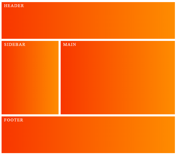
So blocks are standalone elements that form the root of your code structure, in this example we have .header, .sidebar, .main and .footer. They have no dependencies on any other blocks/elements on the page.
Contained within each block are elements..
Element
Elements are parts of a block which have no semantic meaning outside of the block. As each element is semantically tied to its block. The syntax is as follows:
.block__element{}
Elements are written using the block name, connected by two underscores.
So for example, our header might contain a logo, nav bar, and search box. These element classes would be named as follows:
.header__logo{}
.header__navbar{}
.header__searchbox{}
Already you can see the beginnings of a more readable code structure. The importance of convention increases dramatically when working on larger projects, especially when working collaboratively.
Modifiers
A modifier is a flag on a block or an element which is used to change appearance, behavior or state. It’s where the one of the great strengths of BEM shines through; modularity. By using modifiers, you can extend a block or element to make it repeatable. This is a big win as it facilitates code reuse and component driven coding. The syntax is like so:
.block--modifier{}
.block__element--modifier{}
A double hyphen -- is added after the block or element followed by the modifier name.
So take our .header__navbar{} element. We may wish to create a modifier for a secondary navbar, which extends the element with additional styles, like so..
.header__navbar--secondary{}
If your styles are basically the same, using Sass you can simply extend from the parent element and then add the modifiers as required. See the below example, which changes the background color of the secondary navbar..
.header__navbar {
  list-style-type: none;
  background: #ff0000;
  padding: 1rem 0;
  text-transform: uppercase;
}
.header__navbar--secondary {
  @extend .header__navbar;
  background: #ff4500;
}
And that’s it! The modifier styles will override the parent. Your code will be much more concise and easier to work with.
Wrapping up
BEM is a simple way to add structure and hierarchy to your front-end development. I hope this brief guide is enough to get you up and running! As always, there’s much more to explore. Check out the following:
Related Posts:

A little about me..
Hey, I’m Tim! 👋
I’m a freelance business owner, web developer & author. I teach both new and experienced freelancers how to build a sustainable and successful freelancing business. Check out my Complete Guide to Freelancing if you'd like to find out more.
While you're here, you can browse through my blogs where I post freelancing tips, code tutorials, design inspiration, useful tools & resources, and much more! You can also join the newsletter, or find me on X.
Thanks for reading! 🎉