In this tutorial, we’ll be learning about the CSS Box Model!
Understanding the box model is a key concept to grasp in CSS. And for many, learning the box model provides a real moment of clarity — where CSS layouts start to really make sense!
The thing to remember is that each element in web design, is a rectangular box.
The Box Model
When rendering a document, the browser see’s each element as a rectangular box — this is the box model. The CSS determines the size of the box based on a few properties:
- Content
- Padding
- Border
- Margin
Perhaps the best way to visualize this, is to open your browser DevTools and see how it is displayed:
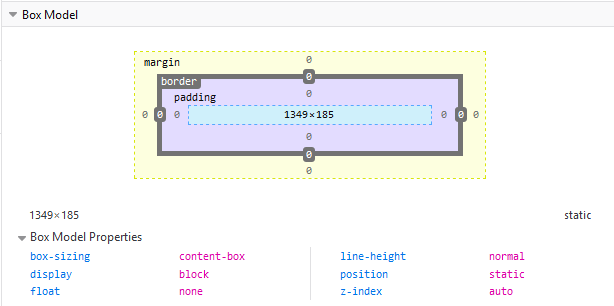
Here you can examine the box model of any element on a page! Check this out by right-clicking an element & selecting Inspect, then see the layout panel in DevTools.
The area in light blue is the content box, around it we have the padding, then the border and finally the margin. This is our box! Within it we have:
Content: This is the area where your content is displayed, which can be sized using width & height properties. It’s typically where text and images appear.
Padding: The padding sits around the content area, its transparent and its size is set using padding properties.
Border: The border box wraps around the padding (if any) and content. Its size and style are set using border properties.
Margin: The margin clears an area outside the border, wrapping the content, padding and border with white-space between this box and other elements. Its size is set using margin properties.
With the box model we can also add a border around elements, and define space between elements.
Typically when you set a width (or height) on the element, those rules will apply to the content area. Any padding, border, or margins are added to that width and height to give the total size of the box.
Calculating the box size
Let’s use an example to see how we calculate the size of our box:
.box {
  width: 300px;
  height: 200px;
  margin: 10px;
  padding: 25px;
  border: 2px solid black;
}
With the above CSS, our box width is actually 354px (300 + 25 + 25 + 2+ 2), and its height is 254px (200 + 25 + 25 + 2+ 2). As the padding and border are added to the width used for the content area.
The margin is not counted towards the size of the box. It affects the space on the page, but only the space outside the box. The box’s area stops at the border — it does not extend into the margin.
Note: If padding or borders are undeclared, they are either zero (if you’ve used a css reset or framework) or the browser default value (which is probably not zero).
CSS Box Sizing
The CSS box-sizing property lets us include the padding and border in our box size calculation — that is the total box width & height.
Without box-sizing
As we’ve seen, the width and height of an element is calculated like so:
width + padding + border = actual element width
height + padding + border = actual element height
As a result, when you set the width or height of an element, it often appears bigger than you might’ve thought (as the element’s border and padding are added to the specified width & height).
In the below example, the two elements end up being different sizes, as item2 has padding specified:
.item1 {
  width: 300px;
  height: 200px;
  border: 3px solid green;
}
.item2 {
  width: 300px;
  height: 200px;
  padding: 50px;
  border: 3px solid red;
}
The box-sizing property solves this problem!
Using box-sizing
With box-sizing CSS includes the padding and border in the element's total width and height.
Set box-sizing: border-box; on an element, like so:
.item1 {
  width: 300px;
  height: 200px;
  border: 3px solid green;
  box-sizing: border-box;
}

.item2 {
  width: 300px;
  height: 200px;
  padding: 50px;
  border: 3px solid red;
  box-sizing: border-box;
}
Now it’ll make much more sense when we lay out elements. As they’re sized in a much more intuitive way — with the padding and border included in the total height/width.
Many developers want this to apply to all elements on their pages. A simple way to ensure this is to implement the following CSS rule:
* {
  box-sizing: border-box;
}
And there you go! We’ve looked at the Box Model & how its defined, as well as how to calculate the box size on our elements & how to apply the box-sizing property to handle our sizing more intuitively.
In the next tutorial, we’ll be looking at Margins, Padding & Borders in more detail. Be sure to check this out to build upon your knowledge of the box model!
Related Posts:

A little about me..
Hey, I’m Tim! 👋
I’m a freelance business owner, web developer & author. I teach both new and experienced freelancers how to build a sustainable and successful freelancing business. Check out my Complete Guide to Freelancing if you'd like to find out more.
While you're here, you can browse through my blogs where I post freelancing tips, code tutorials, design inspiration, useful tools & resources, and much more! You can also join the newsletter, or find me on X.
Thanks for reading! 🎉